NOTE: This is Preview product and final may have changes.
The Skype for Business Android Preview has now started. (https://www.skypepreview.com/)
Some of the changes I’ve noticed in summary
- Obviously Skype colors and styles
- The Home/Dashboard screen is Upcoming meetings, Recent Conversations & Search Contacts
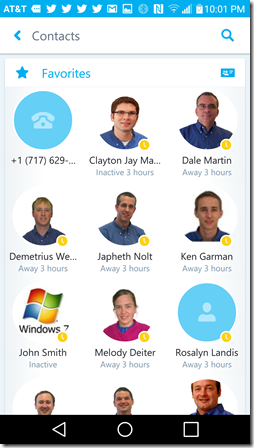
- Favorites Contacts are in a “grid” format compared to Lync “list” format (uses tablet width more gracefully)
Some critiques
- buttons/areas for changing between Home/Dashboard, Contacts, Dialer/Voicemail and Change Presence screens are fairly small buttons
- Changing between screens is not 1 click (Home/Dashboard, Contacts, Dialer/Voicemail and Change Presence screens)
- for example: changing between contacts and dialer navigation is back, then dialer instead of just tapping dialer from the contacts screen
The new Android client uses a grid arrangement for contacts as opposed to the Lync list format for contacts. (as shown above)
Contacts and Contact Groups
Favorites and other lists
The Skype for Business Android home screen has areas for Contact Search, Upcoming Meetings and Recent conversations. Microsoft is calling the home screen the “Dashboard”.
The Active Call window looks very “Skype”.
Change presence.
Dialer has new colors, but otherwise looks like Lync.
Looks like Microsoft is doing some nice work in bring Skype for Business branding and features to Android.
Announcing Skype4B Android (Office.com)
https://blogs.office.com/2015/08/11/announcing-the-technical-preview-of-skype-for-business-apps-for-ios-and-android/
What’s New in Skype for Business Android (Office.com article)
https://support.office.com/en-us/article/See-what-s-new-in-Skype-for-Business-for-iOS-and-Android-937cc82c-4f22-4781-acb8-12160354a4f7?ui=en-US&rs=en-US&ad=US


I need to get that APK :)
ReplyDelete