TopBanner

Skype for Business SEFAUTIL Done Right

NOTE: At this time SDR is a project in the research stage. So no guarantees on what we can ultimately deliver. What is noted below is research/viability testing/prototype demos. Any future product may have features considerably different than represented below.)

This article is some of our notes on the possibility of creating a SEFAUTIL replacement that fixes some of the issues with the current SEFAUTIL. Codename: “SEFAUTIL Done Right” (SDR).

We suspect that some of our findings will be interesting to Skype for Business/Lync IT Pros so we will keep you up to date with our findings.

Performance: Some quick notes on SDR vs SEFAUTIL performance

We did very informal testing on a mediocre lab Standard Edition server. Below is a comparison:

  • SEFAUTIL takes an average of 14 seconds per contact to read or write a setting.
  • Our prototype SDR tool writes setting change at a rate of 100ms (.10 second) per contact.


Admin/Mass Contact Change Interface: Powershell

image

The Administrator interface for SDR is PowerShell commandlets:

  • set-csUserForwarding
  • set-csUserPresence
  • set-csUserNote

Powershell cmdlets can have piped input allowing easy mass changes.

User/Single Contact Change Interface: Instant Message Bot

The user/colleague change/single contact change interface (as oppose to the admin/mass change interface) is using an IM bot.

Commands:

  • /ChangeForwarding
  • /ChangePresence:AppearAway, Available, Donotdisturb, etc. <sip:user_uri>
  • /ChangeNote:This is the note text <sip:user_uri>
    • Alternative: /cn:This is a note text <sip:user_uri>

Note that ChangePresence is really just an example (and not actually that good of one for the Admin mass change side of things) Imagine call forwarding change like “/setfwddestination” to better imagine a Admin mass change.

Also, as you watch you can take note of the time to actually make the change.


What Would You Name This IT Pro Tool?

Also welcome any input on what might be a good final name to call this type of an IT Pro tool.

This is a Landis Technologies team effort even though I get to communicate and I want to recognize those involved: Japheth Nolt, CJ Martin, Wendell Martin and more.

Skype for Business iOS Is Here

image

The Skype for Business app for iOS is now here.

The app sports the same new home screen as the previously released Android app which puts Search Contacts, Upcoming Meeting and Recent conversations forefront as compared to the older app that had search and contact list in the focus.

In call control buttons are nice and big, which means finger friendly and very reminiscent of the Skype consumer app. Microsoft must be thinking users will not be frequently browsing the contact list or dialing via the dialpad as navigation to those screens have smaller buttons.

New Features:

  • Simultaneously view content and speaker video
  • Full screen video
  • Skype for Business look
  • ADAL based authentication / multi-factor authentication

iOS gets some features I’ve notice are not on Android (Preview)

  • Ability to switch on a conversation to delete it
  • Emoticons

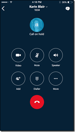
Some screenshots: active call

image

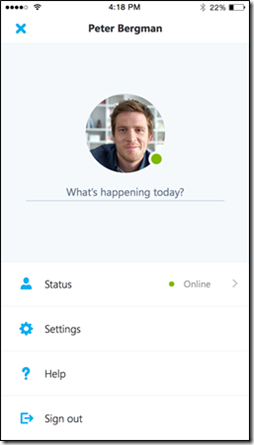
Changing Presence: 3 taps: My picture | Status | Presence

image

Get the App:
https://itunes.apple.com/us/app/lync-2013-for-iphone/id605841731?mt=8

Manual/Training Doc:
http://www.microsoft.com/en-us/download/details.aspx?id=49123

Office Blog about iOS Skype4B App
https://blogs.office.com/2015/10/14/skype-for-business-ios-app-now-available/

Skype for Business Android (Preview): First Look

Screenshot_2015-10-07-22-01-36

NOTE: This is Preview product and final may have changes.

The Skype for Business Android Preview has now started. (https://www.skypepreview.com/)

Some of the changes I’ve noticed in summary

  • Obviously Skype colors and styles
  • The Home/Dashboard screen is Upcoming meetings, Recent Conversations & Search Contacts
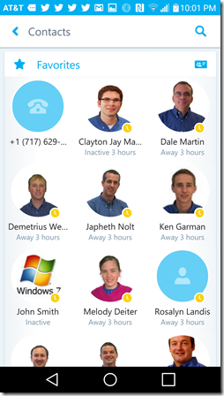
  • Favorites Contacts are in a “grid” format compared to Lync “list” format (uses tablet width more gracefully)

Some critiques

  • buttons/areas for changing between Home/Dashboard, Contacts, Dialer/Voicemail and Change Presence screens are fairly small buttons
  • Changing between screens is not 1 click (Home/Dashboard, Contacts, Dialer/Voicemail and Change Presence screens)
    • for example: changing between contacts and dialer navigation is back, then dialer instead of just tapping dialer from the contacts screen

The new Android client uses a grid arrangement for contacts as opposed to the Lync list format for contacts. (as shown above)

Screenshot_2015-10-07-22-01-36

Contacts and Contact Groups

Screenshot_2015-10-07-22-02-23

Favorites and other lists

Screenshot_2015-10-08-09-55-33

The Skype for Business Android home screen has areas for Contact Search, Upcoming Meetings and Recent conversations. Microsoft is calling the home screen the “Dashboard”.

home-dashboard

The Active Call window looks very “Skype”.

Screenshot_2015-10-07-23-12-23

Change presence.

Screenshot_2015-10-07-21-57-31

Dialer has new colors, but otherwise looks like Lync.

Screenshot_2015-10-07-21-57-06

Looks like Microsoft is doing some nice work in bring Skype for Business branding and features to Android.

Announcing Skype4B Android (Office.com)
https://blogs.office.com/2015/08/11/announcing-the-technical-preview-of-skype-for-business-apps-for-ios-and-android/

What’s New in Skype for Business Android (Office.com article)
https://support.office.com/en-us/article/See-what-s-new-in-Skype-for-Business-for-iOS-and-Android-937cc82c-4f22-4781-acb8-12160354a4f7?ui=en-US&rs=en-US&ad=US

Jabra Speak 810: Pre-Review Observations on the “Puck” That Grew Up

image

I have always liked the Jabra Speak devices ever since I got my first “puck”, which is now a staple in my traveling computer bag. It’s interesting to see Jabra go up market and I am especially interested in their new “Zoom Talk Microphone” technology that is designed to filter out sounds other than the human voice. (I’m hoping to do a hands on review just as soon as I gets my hands on this device)

Quick List of Specs of Note:

  • Connectivity
    • USB
    • NFC
    • Bluetooth
    • 3.5mm jack
  • 4 microphones
  • “Zoom Talk Microphones” filters human voice from background noise
    • eliminate keyboard typing sounds
    • dog barking (but who has one of these in a 15 person conference call?)
  • Support up to 15 users
  • Doesn’t need satellite microphones
    • marketing video shows Jabra Speak 510 and 410 beside the 810, but this is NOT to suggest the need satellite speakers
  • Powered by …
  • USB charge out port lets you charge a tablet or phone
  • Kensington lock slot
  • Size 14” long by 7.5” wide (source)
  • Looks like standard Jabra Speak call control buttons and no remote.

Listed Price $599USD

Don’t get confused, the Speak 810 does not use satellite speaker/mics. Just clumsy? marketing.

image


Also see:
http://austinhuttonuc.com/2015/10/01/the-jabra-speak-810-review/

Jabra Marketing
http://www.jabra.com/support/Speak-810-UC_7810-209
https://www.youtube.com/watch?v=pliv2j_yzwM

http://www.zones.com/site/product/index.html?id=103298542